Our in-house developed CMS allows a site to be styled with a base colour, which we use to derive other colours and build a theme. We also check these colours for contrast according to WCAG 2.1 - specifically AA contrast.
Recently the University graced us with a new palette of brand colours which led us to find that our theme generator was choosing non-contrasting colours - white text over a fairly light colour, for example. After digging into this I discovered that it was down to our use of Less’s contrast() function. This function picks between two colours based on which one might be most contrasting against the chosen background. Essentially if the gamma-corrected luminance of the background is less than 50%, it returns the light colour, otherwise it returns the dark colour.
This is quite different from the WCAG function for contrast, other than correctly using luminance. The result in practice is that we were choosing the lighter text colour in situations where it was not passing AA and the darker text colour would have done.
The WCAG formula for contrast between any two colours looks like this:
(Llight + 0.05) / (Ldark + 0.05)
Where the two values Ldark and Llight are the luminance of the darker and lighter of these colours. We are going for WCAG’s AA contrast ratio of 4.5:1 so the idea is to evaluate this twice for our light and dark colours, and use one of the options that returns at least 4.5.
There is no built in function to do this and although you can write plugins for Less.js, due to the way our brand library is distributed and compiled by each app, that wasn’t practical. It would need to be implemented in vanilla Less. Luckily since we are on at least Less 3.5, we can access calculated properties and get an approximation of a function.
This is the WCAG contrast formula in vanilla Less as a mixin:
#wcag {
  .contrast-ratio(@c1, @c2) {
    @c1-luma: luma(@c1);
    @c2-luma: luma(@c2);

    @light-luma: max(@c1-luma, @c2-luma);
    @dark-luma: min(@c1-luma, @c2-luma);

    @result: round(unit(((@light-luma+5)/(@dark-luma+5))), 2);
  }
}
We can now calculate the proper ratio for any two colours. This function builds on it to return whichever text colour provides the best contrast against a background colour (though notably it can’t guarantee that the result will actually be AA, without modifying the input colours):
#wcag {
  .contrast(@background, @light, @dark) {
    @contrast-ratio-light: #wcag.contrast-ratio(@background, @light)[@result];
    @contrast-ratio-dark: #wcag.contrast-ratio(@background, @dark)[@result];

    @result: if(@contrast-ratio-dark >= @contrast-ratio-light,
      @dark,
      @light
    );
  }
}
We can now replace most of our calls to contrast(..) with invocations of #wcag.contrast(..)[@result].
We have a variation on this function, #wcag.contrast-fallback, that will always prefer one colour even if both options pass AA contrast, which is used in some specific situations. I did find an interesting blog post that boiled down this case, if you had your dark text colour to hand, into just a threshold percentage that you can pass to the Less contrast function and get the same behaviour. In our case, since we needed to do more complicated stuff anyway, it made sense to explicitly calculate the contrast ratio for readability.
Finally we have what I have called ultra-contrast which will return both a foreground and a background colour - the background colour will potentially be darkened or lightened in order to make it more likely to return a pair of colours that pass AA contrast, even if that means adjusting the background colour. We use this in one place where the background is based on an 80% tint of the background colour, and one of the colours in the new palette was failing AA against both text colours. In this case it now lightens the background so that it can pass AA against black.
I won’t include that function because it’s a pyramid of nested if() functions, but rest assured that it is very delightful to look at.
The last thing I needed to do was to rationalise how we define colours in the theme. When it was initially written there wasn’t as much consideration for colour contrast and so some colours were hardcoded to black or white, and others made assumptions about the colours being sufficiently contrasting against a white background. Instead I defined a fixed set of colour pairs, each of which are known to contrast against each other correctly, and then updated other areas to only reference those variables.
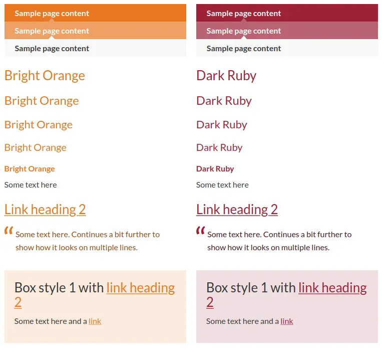
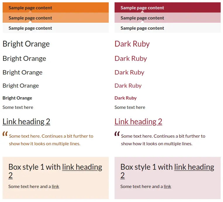
Now all our brand colour themes pass Lighthouse accessibility testing. The next step is going to be re-implementing our themes with CSS Variables, to reduce the payload and to allow them to be reused in Web Components without the theme needing to style them specifically.